Visualising distributions
Some thoughts on visualising the shape of a distribution of observations of data.
Summary statistics
The simplest thing to do is to compute a handful of statistics of the sample: things like its mean and median tell you where the middle of the distribution is, things like its variance or interquartile range tell you how spread out it is, and various percentiles can tell you the properties of its extreme values. Reducing a sample to a few numbers is particularly useful when you have a lot of similar samples to compare, but it obviously loses a lot of detail and isn’t very good for exploratory investigations.
Histograms
To look at a sample in more depth, you can draw a histogram by dividing the observations up into bins and plotting the frequency (technically, the frequency density) of observations in each bin as follows.
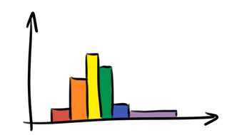
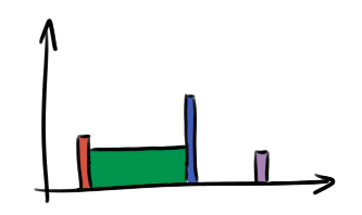
The question of where to draw the boundaries between the bins is a thorny one, and different choices can give quite different results, particularly if the sample is small:
Kernel density estimates
A kernel density estimate is a fancy way to estimate the probability density of the distribution from which the observations were drawn. It’s essentially a smoothed version of a histogram:
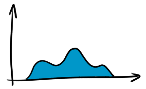
As with histograms, there’s considerable freedom to choose its parameters, and different parameters give quite different results.
Cumulative frequency diagrams
A cumulative frequency diagram (CFD) is simply a graph of the number of observations less than each data point:
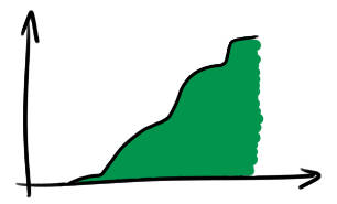
Unlike the visualisation techniques above, there aren’t really any parameters to choose when drawing a CFD, so they’re a lot closer to the raw data. Because of this, you can read lots more meaningful information off them. For instance, the minimum, median, and maximum are shown here:
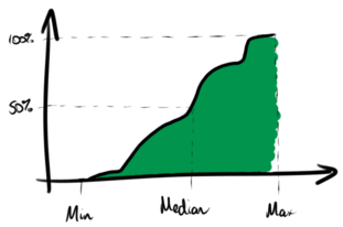
Quartiles and other percentiles can be identified similarly. Also, unlike those above, there’s no smoothing or grouping of the underlying data so there’s less chance of something interesting being hidden during the drawing process.
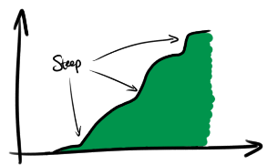
They’re less familiar, but it doesn’t take much practice to get used to reading a CFD. For example, regions where the curve is steep are regions of high frequency density, i.e. where the samples are more common:
Exceedance curves
Related to the cumulative frequency diagram is an exceedance curve, or complementary cumulative frequency diagram, which is just the same thing but upside-down:
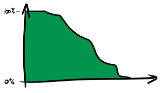
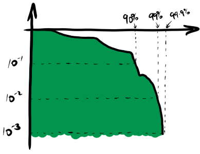
Rather than showing the proportion of samples less than each value, it shows the proportion of samples which exceed each value. On a linear scale this is not any more useful than the usual cumulative frequency diagram, but on a logarithmic scale it highlights the behaviour of the tails of the system very effectively. Here is a logarithmic version of the chart above, showing the 90th, 99th and 99.9th percentiles.
Conclusion
Try using cumulative frequency diagrams and (log-)exceedance curves instead of histograms and kernel density estimates. You might like them. If you don’t, let’s hear about it!